
Govhack 2019: The making of burra.town
What we did to make our Govhack 2019 project on suburbs and a Simcity visualisation.
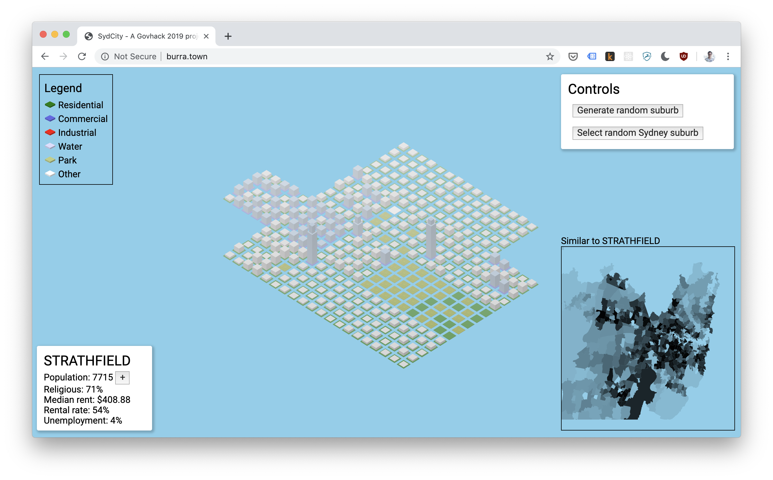
During GovHack this year, we produced a really neat prototype that visualises Sydney suburb development. We called it “Burra.town”.
It was a really fun opportunity to take some time out and just make stupid cool shit. We also took the opportunity to make mapo tofu, a recipe I strongly recommend you to try if you like your spice 😍
At time of writing, the site is still live here, though it is costing me so I might pull it down or consolidate it elsewhere 🤷
We utilised:
- Observables for front-end state management
- ThreeJS for the awesome Simcity-esque visualisation engine
- Heroku for a continuous deployment pipeline, which got us up and running in prod in less than half an hour 🙌
- Jupyter notebooks and PyTorch to do data scraping
I’m going to just break down some of the different technologies and concepts we used, as this was really the fun part that we got to explore during GovHack.
Table of contents
- Break it down {:toc}
Observables
This is a pretty simple one; observables are everywhere in web development now. If you use Angular, React or basically any databinding library, you can almost guarantee that it uses some sort of observable stream under the hood to re-render on observable value change.
We were reluctant to choose a data binding library upfront as we just wanted to move fast and with minimal overhead, so we did what any sane developer should do: we subscribed to observable streams and wrote straight out to the DOM 😎
const loadingRegion$ = new Rx.ReplaySubject<boolean>(1);

// Subscribe to the loadingRegion$ boolean stream;
// the inner function will run every time you call
// loadingRegion$.next(loading) and populate the value "loading".
loadingRegion$.subscribe((loading: boolean) => {
    // Update the randomise button to be disabled when regions loading
    document.querySelector("#randomise-btn")
            .toggleAttribute('disabled', loading);
    // Update the disabled value of the randomise button to be disabled when regions loading
    randomRealSuburbBtn.toggleAttribute('disabled', loading);
});

// Will run the subscription
loadingRegion$.next(true)

// Will run the subscription again
loadingRegion$.next(false)
Towards the end, it did start to feel a little mechanical and slowed our progress down as we started to develop more complex interfaces, especially when it came to extrapolating future growth (we never got this fully working).
But it was surprisingly easy to build all of this and have it “just work”. I really like observables and am keen to use them again for future simple quick hack jobs.
ThreeJS
I’ve had limited success with 3D graphics development in the past. It’s the sort of thing that I’d love to do but never really dug deep into and I don’t have a lot of use cases for it.
This was the first chance I got to concentrate on doing some 3D graphics with ThreeJS. ThreeJS is a library that abstracts the gnarly parts of WebGL and gives you a (relatively speaking) simple canvas to work with.
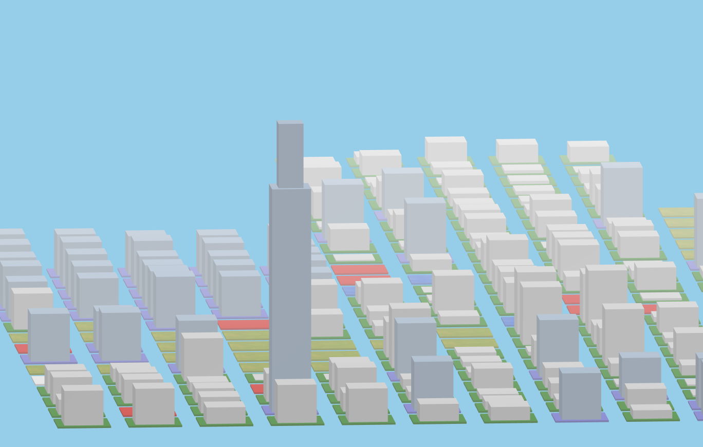
I don’t have a great deal to say about ThreeJS, but I did like the power afforded by the library over something like Isomer, especially now that Isomer seems to be on hold.
The AI and data-munging bits
Jupyter notebooks
Jupyter notebooks are fucking awesome, hands down. They were the backbone of our jerry-rigged data processing pipeline.
They are useful for getting a good feedback loop when doing complex data munging (don’t underestimate the power of this). They can also be really good documentation for the future.
Theoretically, given similar datasets with localities, zoning information, and socioeconomic data about the locality, anyone can clone our repo, and build their own version of burra.town with the scripts we’ve written and a bit of tweaking.
Plus, Github has built-in support for Jupyter notebooks in their file viewer, so you can click this link and see what running the notebook locally would look like.
PyTorch
PyTorch powered the machine learning model we used to generate suburb names randomly when generating new suburbs.
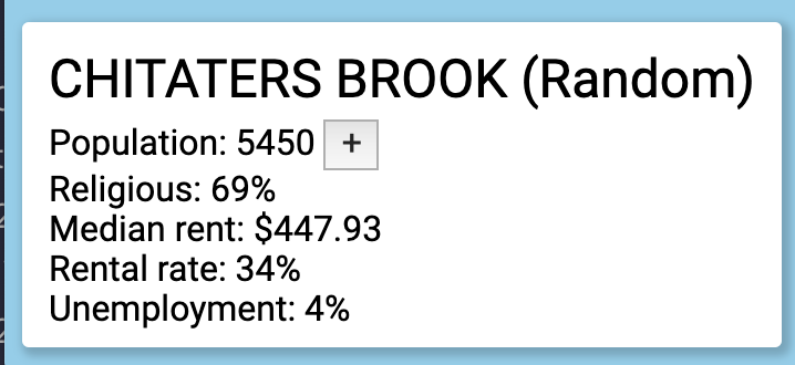
How did we do it?
Our model utilises a recurrent neural network, and we trained it using a window of four letters (i.e. given four letters, predict the fifth letter, ad infinitum). This relies on an initial data processing step that happens offline in Jupyter, and then running the neural net on the server for predicting new suburb names.
If you’re curious about what the heck a recurrent neural network is, take a gander at this famous article that made them super popular.
The offline bit
We grab all the “locality” names from the polygon file we use in the similarity map, and then we use them to train our model by repeatedly feeding them in chunks of four letters, and then asking it to make predictions for the fifth letter, then telling it if it’s “right” or not, ad infinitum for about a minute.
The online bit
We load up the trained net, then repeatedly generate new suburbs by sampling from the net. This sounds a bit hand-wavey, because it is. I recommend checking out the code in names.py.
Honorable mention: self-organising maps
Self-organising maps are kinda having their moment in 2019. They’re a strand of machine learning involving taking a set of data that can be plotted on two or more axes (i.e. a map), then moving them around the map to put them closer to other data that are similar.
That’s…a bit abstract so lets take an example.
For example, if we take a map of the world, and take a bunch of socioeconomic data on countries like GDP, life expectancy, freedom of the press, we can run that through a self organising map and it should “cluster” the countries that are similar.
This will probably result in, for example, wealthy western countries like America, the UK and Australia clustering near each other, while other countries that they “dislike” may cluster together.
The real neat part comes when you start highlighting different facets in that data and see how the self-organising map came to its conclusions. For example - if you highlight GDP from blue to red (where blue = 0, and red = max GDP around the world), you should see several clusters of “red” and “blue” around the place where countries with similar GDP are near each other.
We didn’t end up using a self-organising map, as we found having a simple similarity score was enough for our heatmap of similar suburbs. But I’d love to play around with them in the future.